Stronger
has company.
Shared effort. Individual progress.
ENTER PULSE UNION ↓Pulse Union.
Built around a reason.
People who want a training community that welcomes them without empty intimidation.
Fitness brands can mistake aggression for confidence and leave newcomers unsure where to start.
An open P pulse, cobalt structure and human language build energy around joining rather than proving yourself.
Recognizable
before you read it.
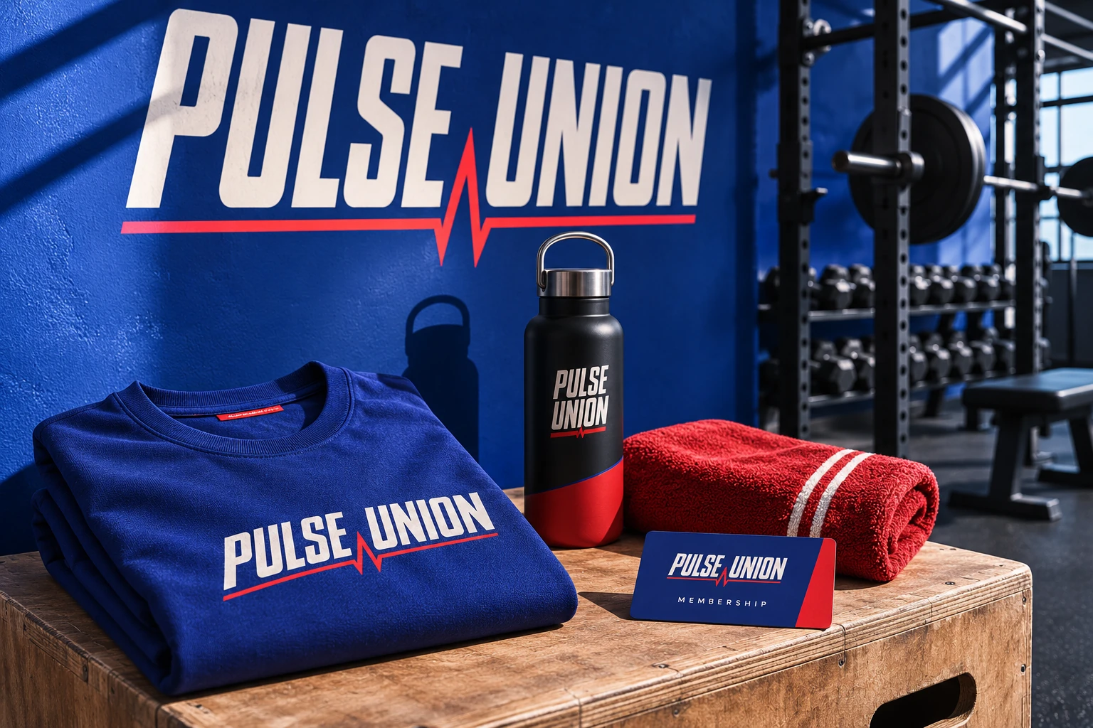
The palette, symbol, type and supporting applications work as one system. Explore the clean board, the material treatment and the complete photographed concept.
has company.
BODY / ARIAL — CLEAR INFORMATION.
Make the next step
feel natural.
A working interaction is stronger evidence than a decorative button. Try this branded flow, then see how the design carries through the result.
Find your starting point.
Make a few choices and preview the next step. The interaction carries the same identity as the physical brand world.
CONCEPT UX DEMO. NO ORDER, BOOKING, PAYMENT OR MESSAGE IS SENT.Find your starting point.
DEMO / NO LIVE TRANSACTIONDon’t take
the adjectives for it.
Inspect the choices and the files. This case demonstrates a design process and an interaction—not invented business results.
The entry path includes a first-session option.
An open P pulse, cobalt structure and human language build energy around joining rather than proving yourself.
TRY THE CUSTOMER FLOW ↑Bring the ambition.
I’ll see the possibilities.
DISCUSS A BUILD LIKE THIS ↗Pulse Union is a fictional concept identity. The applications are visualizations and the customer flow is a demonstration. No revenue, live availability or client relationship is implied.