Good mornings.
Made here.
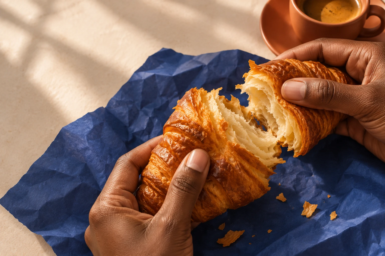
A neighborhood ritual, with a little more warmth.
ENTER BRICK & BUTTER ↓Brick & Butter.
Built around a reason.
Regulars who care as much about the welcome as the pastry.
An independent bakery needs a recognizable daily ritual, not another anonymous kraft-paper label.
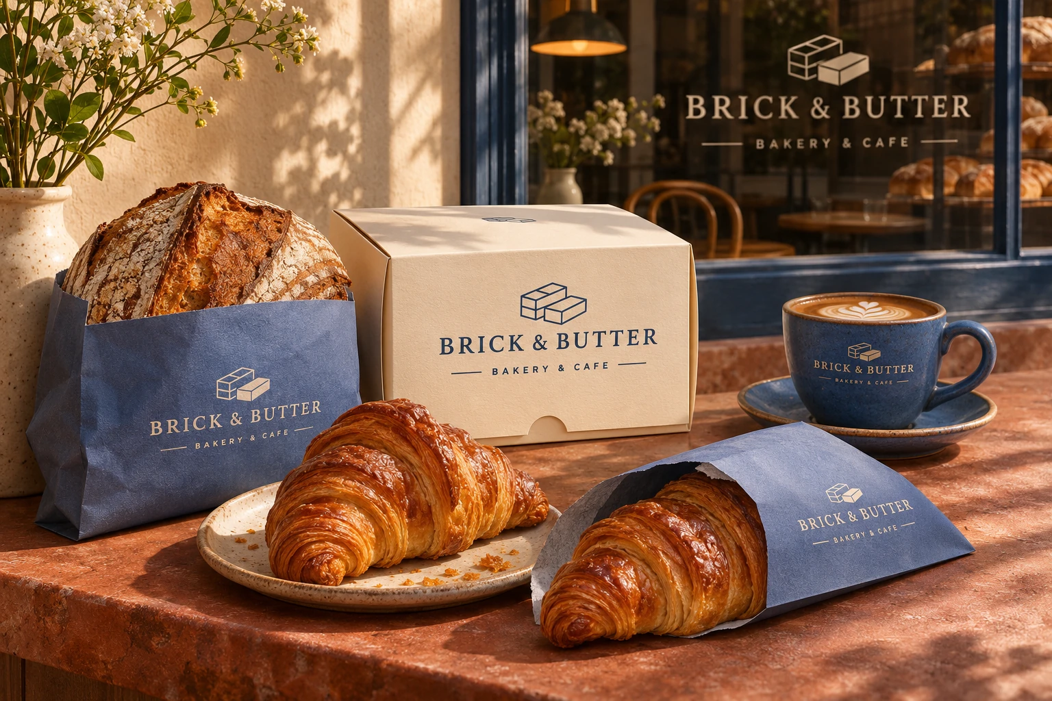
A butter-block motif, blue paper and warm terracotta make the morning feel like a place you belong.
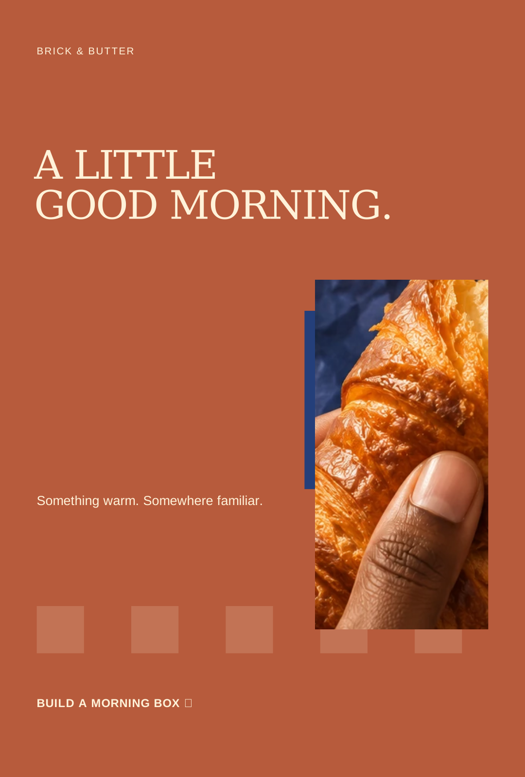
A LITTLE
GOOD MORNING.
Something warm. Somewhere familiar.
A morning ritual becomes a neighborhood signature.
Good
mornings.
Made here.
Warmth in the color.
A welcome in the type.
& ButterTHE MORNING STARTS HERE.b.GOOD
MORNINGS.MADE HERE.
One idea.
Every touchpoint.
For regulars who care as much about the welcome as the pastry.
Why it belongs
to this business.
The butter-block symbol becomes a practical grid for the seal, the menu and the box-builder interface.
Blue paper and terracotta bring recognition to the everyday ritual without overpowering the food.
The campaign moves from appetite to a simple box choice. Familiarity and a useful next step belong together.
Original fictional campaign. Includes six editable SVG applications, three distinct logo-direction studies, copy, rollout and usage guidance. Print artwork is a concept proof requiring final size, bleed, font and supplier checks. No sales results or commissioned-client relationship are claimed.
Recognizable
before you read it.
The palette, symbol, type and supporting applications work as one system. Explore the clean board, the material treatment and the complete photographed concept.
Made here.
BODY / ARIAL — CLEAR INFORMATION.
Make the next step
feel natural.
A working interaction is stronger evidence than a decorative button. Try this branded flow, then see how the design carries through the result.
Build a morning box.
Make a few choices and preview the next step. The interaction carries the same identity as the physical brand world.
CONCEPT UX DEMO. NO ORDER, BOOKING, PAYMENT OR MESSAGE IS SENT.Build a morning box.
DEMO / NO LIVE TRANSACTIONDon’t take
the adjectives for it.
Inspect the choices and the files. This case demonstrates a design process and an interaction—not invented business results.
Packaging reads at a glance.
A butter-block motif, blue paper and warm terracotta make the morning feel like a place you belong.
TRY THE CUSTOMER FLOW ↑Bring the ambition.
I’ll see the possibilities.
DISCUSS A BUILD LIKE THIS ↗Brick & Butter is a fictional concept identity. The applications are visualizations and the customer flow is a demonstration. No revenue, live availability or client relationship is implied.